Colour management at printolino
What is colour management?
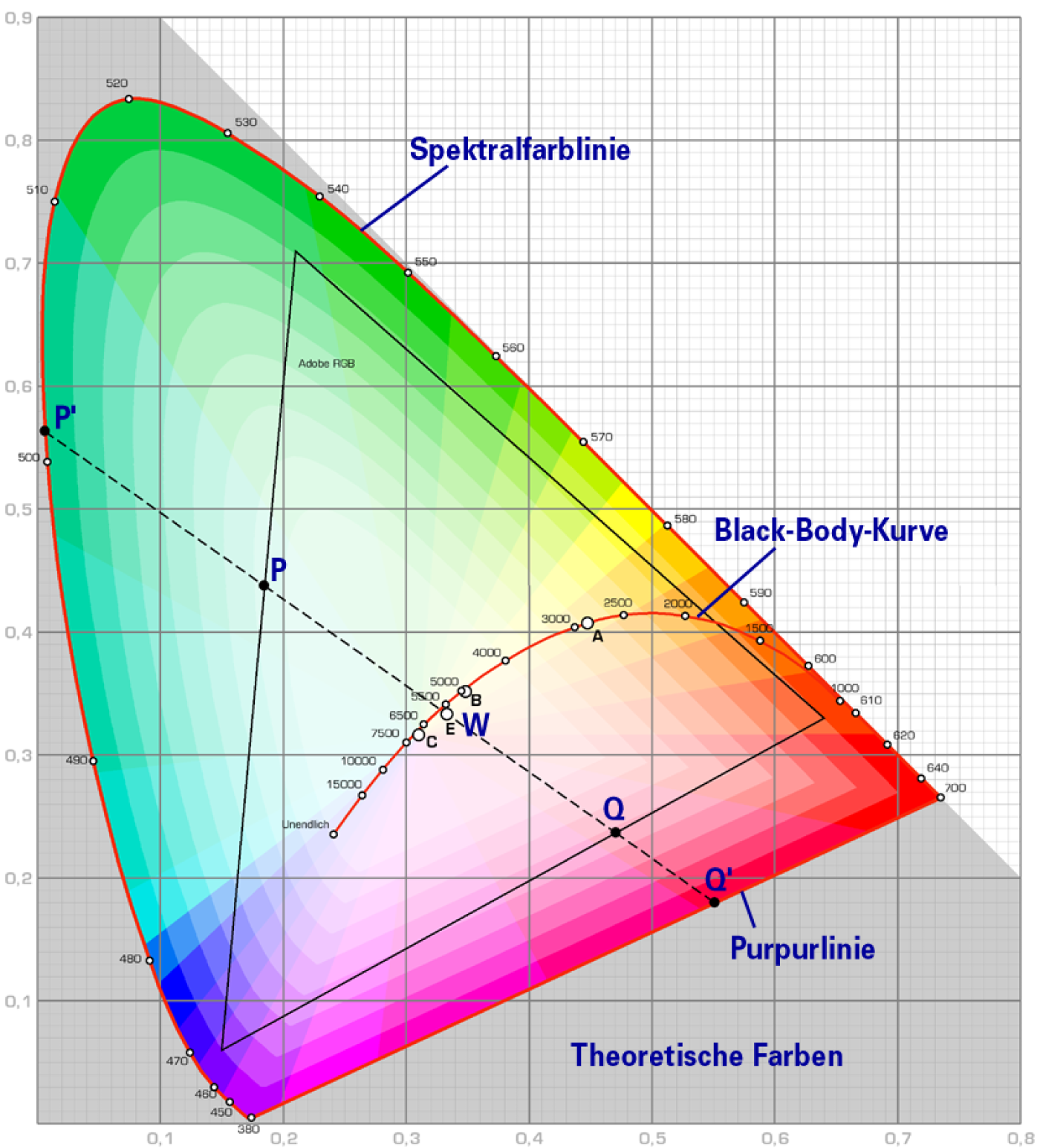
Colour management is the generic term for a very complex topic and stands for all hardware and software measures aimed at ensuring that colours can be reproduced as similarly as possible by various devices such as scanners, monitors, printers, etc.
A high degree of similarity between the colours of these devices is known as colour fidelity. To achieve this colour fidelity, colour management systems, or CMS for short, are used. However, these never achieve a 100% colour match in any print shop. However, a colour management system can ensure that every device displays the colours approximately the same.
For devices, the so-called ICC profiles are used for this purpose.
We would like to emphasise that we can only briefly touch on this topic in this blog. After all, colour management is so extensive that entire books could be written about it.
What is an ICC profile?
The abbreviation ICC stands for "International Color Consortium" and was founded in 1993 as an association of many manufacturers of graphics, image processing and layout programs with the aim of standardising colour management systems.
An ICC profile is a data set and contains all the information that a specific device (monitor, printer, scanner, etc.) needs to display the colours correctly.
Such information includes, for example
- Colour space
- Maximum colour application
- Raster process
So when you calibrate devices, a separate ICC profile is written for each of these devices. When calibrating a monitor, an ICC profile is written. When a printer is profiled, an ICC profile is written. The colour space is specially adapted to the parameters of the printer and the products. For this reason, we even write a separate ICC profile for each medium, i.e. for each paper.
You can perhaps imagine this as meaning that the colours of a print should be displayed "equally" on every paper, regardless of the substrate. So that the colours can be printed "similarly" on a yellowish paper as on a bright white paper, a separate ICC profile is written for each of these papers that describes how and in what quantity the colours should be printed. This is the only way to achieve the highest possible colour fidelity to the original file and obtain two prints on different papers, but where the print looks similar.
Printolino writes its own ICC print profiles
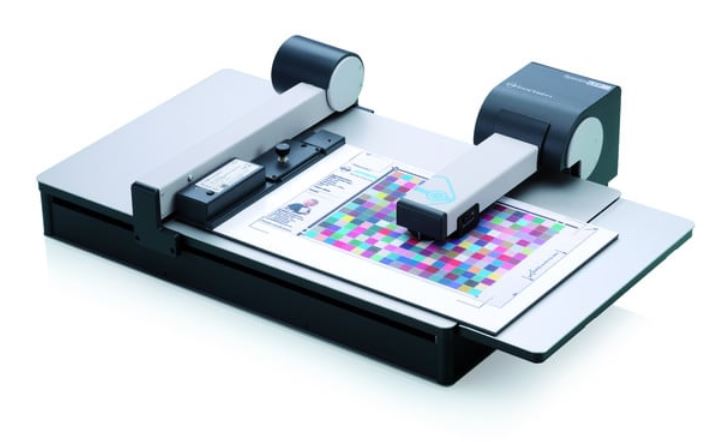
Bei uns wird Qualität ganz gross geschrieben. Wenn die Qualität stimmen muss, muss man die Farben im Griff haben – und das haben wir. Um eine konstante Qualität zu gewährleisten, schreiben wir alle unsere Druckprofile selber und prüfen diese regelmässig nach. Dazu verwenden wir ein sehr modernes Spektralphotometer von Barbieri. Nur so können wir unseren Kunden die bestmögliche Qualität und eine möglichst hohe Farbtreue zur Originaldatei bieten.
The ICC profiles from printolino
All ICC profiles of our Hahnemühle products are available for download. The aim of this option is to enable you as a customer to simulate the print result as authentically as possible before the ordering process, also known as a soft proof.
Soft proof refers to the print-accurate colour representation on a calibrated monitor (see blog report "How do I calibrate my monitor?"). This can
of course only ever be approximate and also depends on the quality of the monitor. By optionally activating the paper white simulation, the colour of the unprinted carrier material (paper) can also be included in the monitor display.
ZIPMit dieser ZIP-Datei können Sie alle ICC-Profile von Hahnemühle herunterladen↓How do I create a soft proof?
Soft proofing in Adobe Photoshop is very simple:
- Download ICC profile
- Install ICC profile in the operating system
For Windows: Right-click > Install profile
For Mac OS X: Move manually
| Operating system | Path |
| Mac OS X | MacintoshHD:/Library/ColorSync/Profiles |
| Mac OS 9 | MacintoshHD:/System Folder/ColorSync Folder |
| Windows 2000 | C:/winnt/system32/spool/drivers/colour |
| Windows XP, Vista, 7, 10 | C:/windows/system32/spool/drivers/color |
- Launch Adobe Photoshop
- Open the file to be simulated
- Menu > View > Proof setup > User-defined
- Select the newly installed profile under "Device to be simulated"
- Do not select "Receive RGB numbers"
- Render priority "Relative colourimetric" with "Depth compensation"
- Optionally, "Simulate paper colour" can be selected
- Confirm with OK
- Check your colour profile in full screen mode on a grey background
The soft proof is now active for your template. Use the key combination CTRL+Y to switch it off and on again. It is often helpful to show the colour gamut warning (SHIFT+CTRL+Y). This temporarily marks all tonal values outside the colour gamut of the paper to be printed. This makes it possible to optimise larger colour spaces to the colour gamut of specific output devices.
We hope you found this article on colour management helpful 😀